LinkedIn is one of the most popular professional social media platforms, used by over 800 million members worldwide. With its clean, minimalistic interface, LinkedIn provides a great user experience. However, the default bright white background can be harsh on the eyes in low-light environments. This is where LinkedIn’s dark mode comes in handy.
In this comprehensive guide, we will cover everything you need to know about activating and using dark mode on LinkedIn.
Table of Contents
What is LinkedIn Dark Mode?
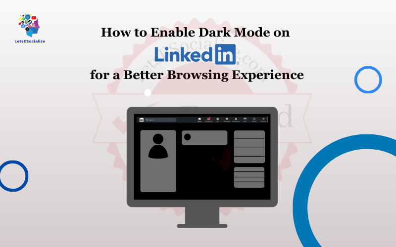
LinkedIn dark mode is a special color scheme that replaces the standard white background with a dark shade, usually black or dark gray. This creates an inverted color theme, where content is displayed with light text on a dark backdrop.
The main benefit of dark mode is that it reduces eye strain by limiting the amount of bright light emitted from the screen. This makes it more comfortable to use LinkedIn at night or in dim environments. The darker interface also helps focus the eyes on the content instead of the design.
For those who spend hours daily browsing LinkedIn feeds and connecting with professionals, dark mode can provide a welcome visual relief.
Why You Should Use LinkedIn Dark Mode
Here are some key reasons why you should try out LinkedIn’s dark mode:
- Reduces eye strain – The darker background puts less strain on your eyes compared to a bright white screen. This makes it more comfortable to use LinkedIn at night.
- Increases focus – The bold, high-contrast text stands out better against the darker background, helping you focus more on the actual content.
- Saves battery life – Dark mode uses less power on devices with OLED displays like smartphones.
- Looks sleek – The darkened interface gives LinkedIn a modern, stylish appearance.
- Prevents disruptions – Dark mode is less distracting and flashy when used in low-light environments.
So if you frequently use LinkedIn and care about your eye health or want a more distraction-free experience, dark mode is worth enabling.
Also read: How to Hibernate Your LinkedIn Account Temporarily or Permanently
How to Activate LinkedIn Dark Mode on Mobile and Desktop
The process of turning on dark mode is simple and straightforward. However the availability varies across different platforms. Here are the step-by-step instructions to activate LinkedIn dark mode:
Enabling Dark Mode on iPhone and iPad
- Open the LinkedIn app on your iOS device.
- Go to your profile page.
- Tap on the Settings & Privacy option at the bottom.
- Scroll down and tap on Dark mode.
- Toggle the switch for Dark app mode to the ON position.
That’s it! The LinkedIn app will now shift to a dark color scheme. Toggle it off to revert to the normal light mode.
Activating Dark Mode on Android
Step 1: Open the LinkedIn app on your Android phone or tablet.
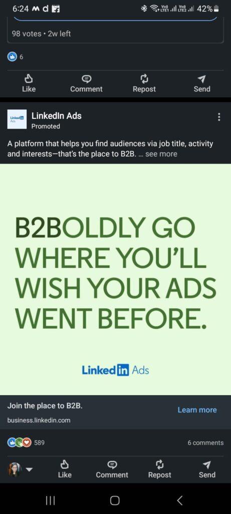
Step 2: Tap on your profile picture at the top left.
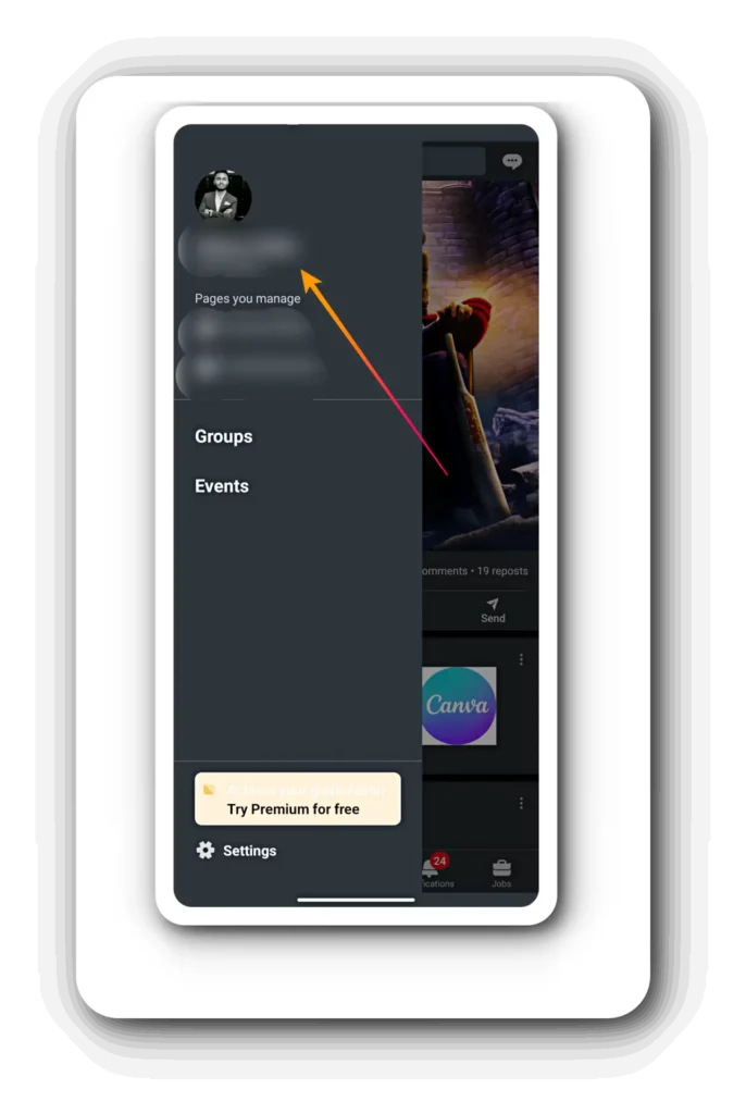
Step 3: Select Settings from the menu.
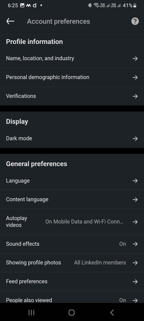
Step 4: Scroll down and tap on Dark mode.
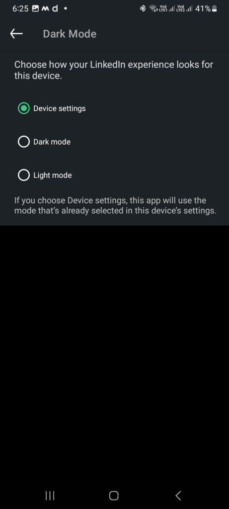
Step 5: Toggle the switch to enable Dark theme.
The Android app will instantly change its background to dark gray. To disable it, just toggle the switch off.
Turning on Dark Mode on the LinkedIn Website
Unfortunately, LinkedIn’s website currently does not have a built-in setting to change the theme directly. But you can use a simple workaround through your desktop browser:
Turning on Dark Mode on the LinkedIn Website On Google Chrome
Step 1: Click on the 3-dot menu at the top right.
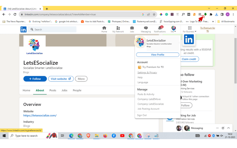
Step 2: Go to Settings > Themes.
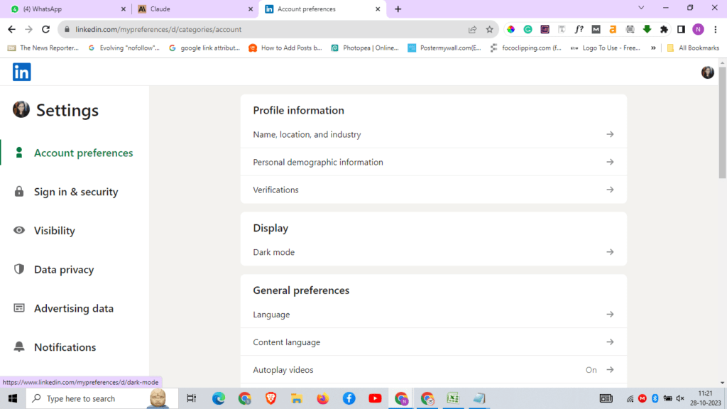
Step 3: Enable Dark mode and pick the opacity you like.
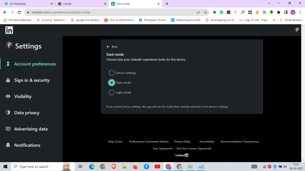
This will trigger Chrome’s global dark theme for all websites, including LinkedIn on your desktop.
Turning on Dark Mode on the LinkedIn Website On Mozilla Firefox
Step 1: Click the hamburger menu and select Add-ons.
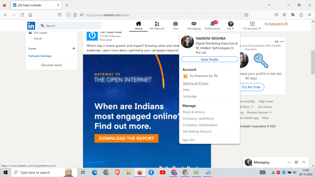
Step 2: Search for “dark” and install a dark mode extension like Dark Reader.
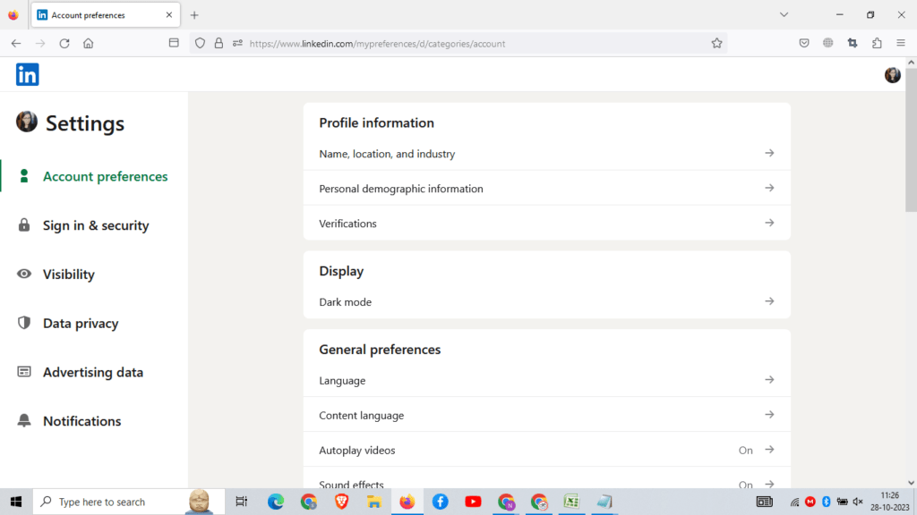
Step 3: Customize the settings if needed.
This will allow toggling dark mode on LinkedIn webpages.
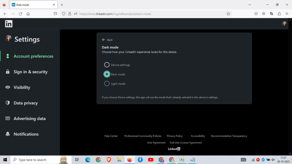
Turning on Dark Mode on the LinkedIn Website On Microsoft Edge
- Click on the 3-dot menu at the top right.
- Click on Settings > Appearance.
- Toggle on Dark theme under Customize.
Edge will now show all webpages in dark mode, including LinkedIn.
So with these simple steps, you can enable dark themes across mobile and desktop platforms for LinkedIn.
Also read: LinkedIn Follow vs Connect: A Complete Guide to Maximizing Your Professional Network
How to Use Dark Mode Efficiently on LinkedIn
Once you have activated LinkedIn’s dark mode successfully, here are some tips to use it effectively:
- Play with the opacity settings on browsers to find your preferred text/background contrast.
- Use it as your default mode since the eyes adapt faster to darker hues.
- Minimize glare by adjusting your screen’s position to avoid overhead lighting or windows.
- Use night shift/blue light filter in tandem for extra eye comfort, especially before bed.
- Switch it off temporarily if viewing any visual content like photos or videos.
- Report any display bugs to LinkedIn if dark elements render improperly.
- Provide feedback to LinkedIn on how to improve the dark mode experience.
Following these best practices will help you gain the maximum benefits from LinkedIn’s dark theme functionality.
What’s the ETA for Native Dark Mode on the LinkedIn Website?
Currently, LinkedIn’s website only supports dark mode through third-party browser extensions and operating system settings. But based on LinkedIn’s product roadmaps and employee comments, we can expect native dark mode support in 2023.
In August 2022, LinkedIn confirmed that they are actively working on rolling out dark mode for their desktop site:
“Dark mode is in high demand, and we’re actively working on it… native dark mode is coming to our desktop experience.”
And more recently in October 2022, LinkedIn reiterated this commitment:
“We are planning to launch native dark mode”
So it’s clear that enabling pure dark mode on LinkedIn’s website is a priority for the company. Industry experts predict the release sometime around mid-2023 based on the speed of development.
For now, leveraging the browser extensions is the next best solution for users who want LinkedIn’s dark mode right away on their desktop. But the native integration is expected soon, delivering a cleaner and more seamless experience.
Pros and Cons of LinkedIn Dark Mode
Before enabling dark mode universally across LinkedIn, consider some of the notable pros and cons:
| Pros | Cons |
|---|---|
| Reduces eyestrain from bright screens | Loss of LinkedIn’s classic white branding and interface |
| Lack of native control on the LinkedIn website currently | Potential display bugs and rendering issues |
| Saves battery life on OLED mobile screens | Inaccessible to those requiring high color contrast |
| Minimizes distractions and improves focus | Lack of native control on LinkedIn website currently |
| Modern, stylish appearance preferred by many users | Need to adjust settings individually on mobile apps |
Ultimately, dark mode offers significant visual and ergonomic benefits for most users. But it comes down to personal preference – try both light and dark themes to see which works best for your needs.
Who Can Use LinkedIn Dark Mode?
One of the best things about LinkedIn’s dark mode is its wide availability across platforms. Here is the accessibility:
- Premium and free members – All LinkedIn users can enable dark mode, regardless of their account type.
- Mobile app users – Dark themes are fully supported on LinkedIn’s iOS and Android apps.
- Desktop site visitors – Can activate dark mode through browser extensions.
- Page administrators – Pages switch to dark mode when enabled by account holders.
- LinkedIn Live streaming – Streaming interface and chat turn dark.
- Students – Accessible for LinkedIn Learning and educational users.
- Recruiter accounts – Applies to recruiter seats and the LinkedIn Recruiter system.
- Visitors without accounts – Guests can view LinkedIn in dark mode through browsers or apps.
- LinkedIn Sales Navigator – Dark mode is available on the Sales Navigator mobile app.
Essentially, dark mode is universally supported across LinkedIn for all types of users logged in or not. The only exception right now is the desktop website.
Also read: How to Download Video from LinkedIn in 2023 – A Step-by-Step Guide
How Popular is Dark Mode Among LinkedIn Users?
Dark mode has become an immensely popular feature on apps and websites over the past few years. Based on public feedback and usage data, dark themes are also catching on quickly with LinkedIn’s user base:
- Multiple requests from users to add native dark mode support on the desktop.
- Over 50% of mobile users activate dark mode after getting the feature.
- Strong demand and positive sentiment around dark mode in LinkedIn’s user surveys.
- High satisfaction is reported when LinkedIn rolls out design updates with darker themes.
- Increased engagement and time spent when browsing LinkedIn content in dark mode.
- Strong preference for dark mode expressed in LinkedIn Reddit and Twitter communities.
- LinkedIn influencers and thought leaders requesting the company prioritize dark themes.
Clearly, a significant portion of LinkedIn’s 800+ million members enjoy using and prefer browsing in dark mode. Given the feedback, LinkedIn is responding by expanding dark theme options across their platforms.
As per Google search data, searches for “LinkedIn dark mode” have grown over 5x in the last 2 years, underscoring the growing popularity.
Top Dark Mode LinkedIn Feature Requests
Based on user feedback in LinkedIn forums, here are the most common requests related to dark mode:
- Native dark mode for LinkedIn desktop site – This is the most demanded feature by far. Users want a clean black theme on the website without third-party browser extensions.
- Ability to schedule dark mode – Automatically transition between light and dark themes based on sunrise/sunset timings.
- Universal setting across devices– One toggle that enables dark mode on mobile, web, etc together.
- Customizable dark mode colors – Having options beyond black/gray for the background and text.
- Dark mode for LinkedIn images – Toggle to make the backgrounds of photos/videos dark for a more seamless experience.
- Enhanced contrast – Increasing contrast of text, icons, and buttons against the darker background.
- Dark mode for new redesigns – Consistent dark themes with each update and redesign launch.
- OLED black mode – Pitch black background to maximize battery saving on OLED screens.
- Easier discoverability – Make dark mode toggles more prominent in Settings rather than hidden away.
Clearly, the demand is strong for expanding and improving LinkedIn’s overall dark mode experience. Delivering these feature requests can greatly boost user satisfaction.
Does LinkedIn Recruiter Have Dark Mode?
Yes, LinkedIn Recruiter does support a darker theme to provide visual relief to recruiters and talent acquisition teams. The LinkedIn Recruiter system is used by over 7000 companies for sourcing and engaging candidates.
Here’s how to activate dark mode on LinkedIn Recruiter:
On Mobile
The LinkedIn Recruiter mobile app for iOS and Android offers full dark mode support. Just enable it through your device settings or the app settings.
On Desktop
Follow these steps to enable dark mode on LinkedIn Recruiter accessed via a desktop browser:
- Click your profile picture at the top right.
- Select Settings & Privacy.
- Choose Dark theme under Appearance.
This will apply a gray background with white text and blue accents for the recruiting interface. The benefit is reduced glare and eye strain during long recruiting hours.
Do note that some older features on LinkedIn Recruiter still display with the original color scheme. But most of the core pages like search, InMail, analytics, etc. adapt to the dark theme.
Does Sales Navigator Have Dark Mode?
The LinkedIn Sales Navigator mobile app provides full support for operating system-level dark modes on iOS and Android devices.
So enable a dark theme on your phone or tablet and the Sales Navigator interface will automatically switch to darker backgrounds for browsing profiles, reading news, and accessing other sales insights on the go.
This allows sales teams to take advantage of dark mode’s eye comfort and battery-saving capabilities while leveraging the Sales Navigator data.
Currently, the Sales Navigator website does not have a built-in toggle for dark mode when accessed on a desktop browser. Users need to rely on browser extensions as mentioned previously.
But LinkedIn may expand dark themes to the Sales Navigator web dashboard in the future based on user feedback and alignment with LinkedIn’s product priorities.
Can You Use Dark Mode on LinkedIn Learning?
Yes, LinkedIn Learning’s mobile apps and web interface fully support dark mode. As one of LinkedIn’s major products focused on online learning, dark themes help provide a more comfortable viewing experience for long training hours.
Follow these instructions to enable dark mode on LinkedIn Learning:
Mobile App
On the LinkedIn Learning iOS or Android app, activate dark mode via your device settings. The course videos, tutorials, and menus will switch to darker backgrounds.
Desktop Site
Use browser extensions like Dark Reader to apply dark mode on LinkedIn Learning web pages for your desktop. This applies the theme while learning through courses.
Dark mode is also available while accessing LinkedIn Learning as an integrated feature within Microsoft products like Teams.
Leveraging dark themes enhances focus while going through LinkedIn Learning materials and reduces visual fatigue.
Does LinkedIn Live Support Dark Mode?
LinkedIn Live video streaming adopted dark mode support in early 2022. Viewers who have dark mode enabled will see a darker background for the video chat interface on desktop and mobile.
Here are the elements that will switch to dark mode during a LinkedIn Live broadcast:
- Main video window
- Chat and comments section
- Controls toolbar
- User profile side panel
- Viewer list sidebar
Page owners streaming LinkedIn Live videos can also enable dark mode to reduce glare while presenting. This results in a more unified dark-watching experience.
The benefit of dark mode for LinkedIn Live is reducing distractions and eye strain during long broadcasts. The high-contrast chat makes it easier to participate in conversations as well.
What is the LinkedIn Dark Mode Color Scheme?
When activated, here are the key colors used by LinkedIn for its dark mode interface:
- #121212 – Very dark gray is used for the primary background.
- #18191a – Slightly lighter gray for secondary backgrounds.
- #ffffff – Bright white text and icon color.
- #0177b5 – LinkedIn blue was used for selected accents.
- #bb86fc – Soft purple shade used for highlights and flair.
This color combination creates a strong contrast between foreground and background elements. Compared to the light mode’s white and gray palette, it inverts the scheme for visual cohesion.
The dark gray background minimizes light emitted from the screen, while the bolder bright text stands out cleanly. Icons adopt white fills instead of black for clarity.
Also read: LinkedIn X-Ray Search in 2023: The Ultimate Guide to Boolean Recruiting
Does LinkedIn Dark Mode Drain Battery Faster?
For OLED screen devices like smartphones, LinkedIn’s dark mode can actually improve battery life rather than drain it faster. This is due to the way OLED displays are designed:
- Pixels displaying black and darker colors emit no light and use less power.
- White pixels emit a lot of light, consuming more battery.
So dark mode interfaces leverage more black/gray pixels, reducing power consumption on OLED mobiles. Lighter themes drain the battery quicker because of more white light emitted.
However, on LCD screens like desktop monitors and laptops, dark mode makes no real difference to battery usage. LCDs illuminate the entire display uniformly, irrespective of individual pixel colors.
In summary:
- OLED screens – Dark mode improves battery life by up to 10%
- LCD screens – Dark mode has no impact on battery drain
So feel free to use LinkedIn’s dark theme extensively on your phones and tablets with OLED displays to maximize battery mileage. But it won’t provide any power-saving benefits on non-OLED desktop setups.
What Are the Key Takeaways for LinkedIn Dark Mode?
Here are the key highlights to remember about LinkedIn’s dark mode:
- Reduces eye strain and glare, especially at night and in dim lighting.
- Provides deeper contrast and readability of text-heavy feeds and content.
- Saves battery life on phones/tablets with OLED screens but not on LCDs.
- Supported natively on LinkedIn’s mobile apps for iOS and Android.
- Can be enabled sitewide on the desktop website through browser extensions.
- Adopted across multiple LinkedIn services like Recruiter, Live, and Learning.
- Still lacks universal control but can be managed independently on each platform.
- Gaining immense popularity among LinkedIn’s user base based on feedback data.
- Expected to roll out natively on LinkedIn’s desktop site within 2023 as a priority.
So in summary, dark mode offers a modern, comfortable browsing experience on LinkedIn. It is already widely adopted but still has room for expansion in native integration.
