- X, the social media platform formerly known as Twitter, recently rolled out small but noticeable X changes Like button has switched from a heart icon to an “X” icon.
- This surprise update has left many users puzzled. Does the new X mark represent something completely different than the previous heart symbol?
Table of Contents
Details of the Like Button Change
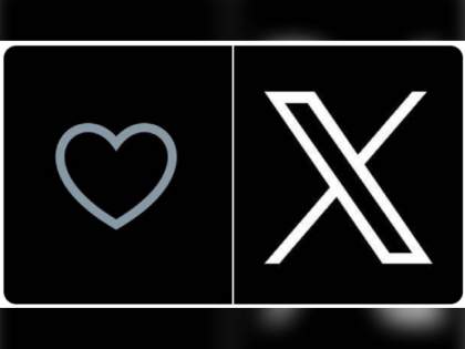
- Without any official announcement, X began changing the Like button from a red heart to a black “X” icon on its web interface and across mobile apps.
- Long-pressing on the X icon still shows the term “Like”, clarifying it represents the same action as before.
- The new X icon is solid black on a white background, providing high contrast and visibility.
- On third-party apps and interfaces that integrate X functionality, the icon remains a heart for now. But these will likely update to the X over time.
Also read: Features of Twitter Blue service
Possible Explanations and Interpretations
- X has not commented publicly on the meaning or intent behind the Like button design switch. Here are some potential reasons:
- Visually distinct icon – The X creates a clear visual separation from the previous heart shape. This makes the Like action easier to distinguish at a glance.
- Emphasize brevity – X is moving away from being a microblogging platform to a more traditional social media site. The X matches the overall minimalist, text-focused aesthetic.
- Symbolic of closing or dismissal – Some speculate the X could represent closing or dismissing a Post, similar to clearing notifications. This is unlikely since Liking something is a positive action.
User Response and Impact
- Overall, the response has been mixed:
- Some appreciate a unique, distinct icon compared to the ubiquitous heart shape across other platforms and products.
- Many long-time users feel nostalgia for the familiar heart icon that has been core to the platform’s identity.
- A vocal portion of users strongly dislike the change, calling the X confusing, overly generic, or simply ugly.
- It remains to be seen if this icon change will stick long-term or be reverted back.
- Since Liking behaviour seems unaffected so far, the icon itself may not matter to most users as long as the underlying action remains the same.
Conclusion
- While only a small cosmetic change, switching the Like button icon from a heart to an X represents the end of an era for X.
- The company seems willing to make updates, however minor, that break from its established Twitter past. This will likely fuel ongoing debate over larger identity changes.
- Users, both new and old, will eventually adjust to this new icon if X decides to make the change permanent. But for now, it signals that no element of the platform – even beloved icons – is off limits to rethinking.