That elongated rectangle atop LinkedIn profiles seems ordinary enough, but don’t be fooled – your banner image makes a major first impression. You want it to stand out for the right reasons, not get cropped or distorted on various screens!
Optimizing your banner size ensures it displays properly across platforms. Follow this handy guide to stitching together the ideal header image that wows wherever it appears. Time to ditch those awkward zoomed-in face pics for professional greatness!
Table of Contents
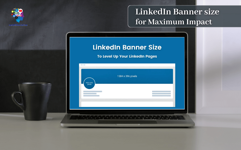
LinkedIn Banner Size Breakdown
| Graphic | Image Size |
|---|---|
| LinkedIn Banner | 1584 x 396 pixels |
| LinkedIn profile picture | 400 x 400 pixels |
| LinkedIn Logo (Company profile) | 300 x 300 pixels |
| Linkedin Cover (Company profile) | 1400 x 425 pixels |
| LinkedIn Image Post (Desktop) | 1200 x 1200 pixels |
| LinkedIn Image Post (Mobile) | 1200 x 628 pixels |
| LinkedIn Cover Image (Overview tab) | 360 x 120 pixels |
| LinkedIn Hero Image | 1128 x 376 pixels |
Let’s start by clarifying the nitty gritty size details for maximum banner brilliance:
LinkedIn Company Logo Size: 300×300 pixels
It is crucial to know that the recommended size for a company logo is 300×300 pixels. Maximum file size is 8MB. PNG or JPEG format is required. This size ensures that your logo looks sharp and clear across all devices, from desktop to mobile. LinkedIn recommends that your logo image be at least 268×268 pixels in size.
Guidelines for LinkedIn Company Logos:
- 300×300 pixels
- 8MB file size
- PNG or JPEG format.
Take a look at Google and Tesla’s LinkedIn accounts for some outstanding examples of company banners. Both organizations utilize high-quality photos that complement their corporate identity and draw visitors’ attention.
Choose an image that reflects your company’s beliefs and mission while designing your banner. It could be an eye-catching photograph, a simple graphic, or even a video.
LinkedIn Company Cover Photo Size: 1400 x 425 pixels
LinkedIn recommends 1400 x 425 pixels high for corporate cover photos for best presentation. For speedier loading times, LinkedIn recommends utilizing an image in PNG, JPEG, or GIF format and keeping the file size under 8MB. Let’s look at two of the most well-known corporations, Google and Apple. We discovered that their cover photo sizes correspond exactly to the desired size.
Guidelines for LinkedIn Company Cover Photos:
- 1400 x 425 pixels
- 8MB file size
- PNG, JPEG, or GIF format.
Sizes of LinkedIn Personal Profile Photos
And here is a banner size recommendation for a personal LinkedIn page.
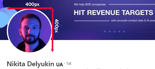
LinkedIn Profile Picture Size: 400×400 pixels
It is recommended that you post a 400×400 pixels image to make it look excellent on your profile. Maximum file size is 8MB. The minimum size for a profile photo, however, is 400×400 pixels. JPG or PNG file format.
Guidelines for LinkedIn Profile Pictures:
- 400×400 pixels
- 8MB
- PNG or JPEG format.
LinkedIn Profile Background Photo Size: 1128 x 376 pixels
When it comes to banner background size, one of 15843996 pixels is preferable. Maximum file size is 8MB. The minimum size for a background photo, however, is 1128 x 376 pixels. PNG, JPEG, and GIF are acceptable formats.
Guidelines for LinkedIn Profile Background Photos:
- 1128 x 376 pixels
- 8MB
- PNG, JPEG, or GIF format.
Sizes of LinkedIn Post Images
If you’re serious about LinkedIn prospecting, you should set things up in such a way that you can publish regularly. However, knowing the recommended size for the photographs in your postings is also essential.
Regularly posting on LinkedIn will allow your brand to be seen more frequently, and if you know what kind of content will entice your buyers, you’ll have an ace up your sleeve very soon. There is only one way to find out what content your audience prefers: start creating content and tracking its performance.
Also read: How to Save LinkedIn Profile as a PDFQ
Design Principles for LinkedIn Banner Images
Now that we’ve got the specs down, let’s move on to the fun part – getting creative with impactful designs! Follow these essential principles when creating your LinkedIn profile banner:
Keep it Professional
Your banner showcases you to your professional network. Keep the imagery, colors, and fonts business appropriate. Save party photos and comic sans for personal sites.
Reflect Your Brand
Let your banner reflect your personal or company brand. Bring in branded colors, fonts and visuals that communicate your unique identity.
Include Your Photo
Research shows profiles are more effective when banners feature your headshot. Position your photo prominently in the top left with room to spare.
Direct the Eye
Use positioning, contrast and directional cues like arrows to move the viewer’s eye across your banner to key points of interest.
Convey Key Messaging
Use text sparingly to highlight your value proposition, tagline or contact info readers should remember. Keep text short and legible.
Add Visual Interest
Inject visual excitement with photos, charts, illustrations or graphic elements that engage viewers as they scroll.
Sizes of LinkedIn Ads Banners
LinkedIn Ads provides a variety of banner sizes, including:
Large Rectangle
The Medium Rectangle banner is 300×250 pixels in size and can be found on the right side of the LinkedIn feed. This banner size is perfect for showcasing product images, branding, and promotional offers.
Skyscraper
The Skyscraper banner is 160600 pixels in size and appears on the right side of the LinkedIn feed. This banner size is ideal for displaying vertical images and can capture the user’s attention while scrolling through the feed.
Leaderboard
The Leaderboard banner is 728×90 pixels in size and appears at the top of the LinkedIn feed. This banner size is ideal for displaying company branding and promotional offers and has the potential to generate a lot of attention.
Rectangle (Large)
The Large Rectangle banner is 300600 pixels in size and can be found on the right side of the LinkedIn feed. This banner size provides more space for product images, branding, and promotional offers.
Advertised Content
Sponsored Content ads appear in the LinkedIn newsfeed and are available in a variety of banner sizes, including Single Image, Carousel, and Video ads. These advertisements can be displayed in a variety of sizes, including 1200×627 pixels, 10801080 pixels, and 1280720 pixels.
InMail Sponsorship
Sponsored InMail ads are sent directly to a user’s LinkedIn inbox and come in two sizes: 300250 pixels and 728×90 pixels.
Also read: LinkedIn Profile Checklist: The Complete Guide to Creating an Amazing Profile (2024)
LinkedIn Story Dimensions
Stories on LinkedIn are an excellent tool for increasing brand awareness — not many businesses are aware of this, so there is value in seizing this opportunity and assisting your company in standing out.
A LinkedIn story should be 10801920 pixels in size. If you stick to these dimensions, your stories will hang beautifully and won’t overwhelm or irritate your prospect’s eye.
So, what do we have in total? Let us summarize briefly.
Formatting Your Banner Image Flawlessly
Banners display differently depending on the device. Avoid distortion with these pro layout tips:
Main Subject Offsets
Position key focal elements at least 400 pixels from left and right edges. This “safe space” prevents weird cropping on smaller screens.
Text Margins
Keep text inside the central 75% zone (1200 pixels wide) so readers don’t have to pan back and forth.
Mobile Considerations
On narrower smartphone views, images get “letterboxed” with black bars on top and bottom. Account for this in your design.
Previews Are Your Friend
Use the LinkedIn preview tool to visualize how your banner will look on various device sizes. Tweak and perfect before publishing!
Ready to create your pixel-perfect banner? Let’s pick the right size template…
Design Tools and Templates for LinkedIn banner
You don’t have to be a designer to create high-impact LinkedIn banners. Leverage user-friendly design tools to produce banners that impress:
Canva
Canva’s free templates and drag-and-drop features make banner creation easy. Resize to exact dimensions required.
Bannersnack
This banner maker has tons of professionally designed templates. Easily add your own images and text.
PicMonkey
PicMonkey’s collage templates and graphic design elements are great for DIY banners.
Adobe Spark
Choose from Bold, Elegant and Professional banner themes and customize effortlessly.
Illustrator/Photoshop
For advanced graphic design, use Illustrator for illustrations or Photoshop for photo editing.
Take the work out of designing a polished banner by starting with templates then customizing with your own flair.
Optimizing Your Banner for Maximum Impact
You’ve got the right size specs, impactful design and tools to put it all together. Now let’s ensure your LinkedIn banner is optimized to get noticed and clicked.
Complete Your Profile
A fully fleshed out profile supports your banner’s first impression. Feature your skills, experience, recommendations and media.
Use a Consistent Color Scheme
Tie your profile photo border, background and banner together using consistent, professional brand colors.
Rotate Out Dated Content
Keep your banner fresh and relevant by updating images and text over time as you progress in your career.
Be Mobile Optimized
Preview how your banner looks on mobile and tweak imagery so text and graphics appear clear on smaller screens.
Add a CTA Button
Drive visitors to action by including LinkedIn’s customizable call-to-action button above your photo.
Analyze Performance
Use LinkedIn’s banner analytics to see impressions and engagement metrics. Identify what works to improve.
By taking the time to craft and optimize a winning LinkedIn banner, you can make a stellar first impression and turn profile views into valuable connections every day.
Common LinkedIn Banner Mistakes to Avoid
We’ve covered the banner best practices. Now let’s highlight some slip-ups to steer clear of so you don’t dilute your professional brand image:
- Stretching low-res images – Pixelated, distorted images look unprofessional. Use high resolution source files.
- Cluttering with too much text – Long paragraphs are tough to read. Use text sparingly.
- Using uncoordinated imagery – Mismatched photos look haphazard. Stick to unified designs.
- Choosing distracting color schemes – Fluorescent colors overwhelm. Keep palettes subtle and muted.
- Uploading sideways banners – Horizontal orientation only. Vertical banners cut off.
- Forgetting your profile photo – No headshot looks suspicious. Feature yourself prominently.
- Outdated information – Stale messaging fails to connect. Keep content current.
With attention to detail, you can dodge these blunders. Now you’ve got all the tips and tools to make an amazing first impression!
FAQs About LinkedIn Banner Specs
Still wrestling with lingering banner size questions? Here are some commonly asked queries:
